By Annette Hester, Project Coordinator, Energy Innovation Center
Open knowledge is what open data becomes when it’s useful, usable and used.” (Open Knowledge Foundation)
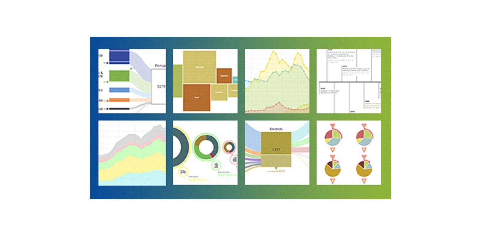
A few months ago, the Inter-American Development Bank (IDB) Energy Innovation Center published a new online energy database that provides an entirely new way of understanding this resource. The database uses art to translate complex information into a comprehensive system that is interactive, user-friendly, and on top of that, beautiful! In this post we will show you four things you can find and do with this database.
1 Spot trends
The database contains quantitative and qualitative information that shows, at a glance, how countries produce and use energy, and how energy markets are organized.
The eight indicators picture energy use over time, by fuel source and sector, for the IDB’s 48 member countries plus Cuba, drawing on data published by the International Energy Agency (IEA) since 1971. The data is updated annually. In the case of countries or regions that are not covered by the IEA (which include most of the Caribbean countries), we gathered and published the data for a specific year. For comparison purposes, the database also includes other major producing or consuming countries and regions.

2 Understand the institutional framework
Together with the eight indicators, we have included relevant information describing the institutional framework and a timeline that shows the current legal configuration of the energy market. With this feature you will be able to understand the structure of the market and what government agencies and private companies operate in it.

In this graph you will be able to see how the private sector participates in the market. Blue boxes indicate that the private sector participates in the market and red indicate the contrary. Grey means there is no data available.

3Visualize and interact with data
For each indicator we have created compelling graphics that will help you understand the evolution of the sector, see trends, and quickly zero in on key challenges, pitfalls, and opportunities. Every graph is interactive and allows you to explore different variables.
For example, if we analyze Costa Rica’s energy matrix in 2012, we can easily understand that a significant portion of electricity generation comes from relatively clean sources but the country is heavily dependent on imported oil products in other sectors.
On the left side of the graph, you can analyze Costa Rica’s primary supply, and when you click on the red box you can see the particular impact of geothermal energy:

On the right side, you will be able to see Costa Rica’s energy consumption. If you click on the dark blue box, this reveals that the country’s transport sector is heavily dependent on imported oil products:

The simple, clear way the information is presented makes it easy to go straight to the substance.
4Download and connect with the data
All our data is available to the public in three different formats—JSON, CSV, and RDF—which allows you to download the data or connect it directly to other applications or databases. Just click on the icon “Download data” on the bottom of each page and download the data set in your preferred format.

And if you want to use the graph in a presentation, click on “download the image” and the graph with references is at your fingertips. If you want to share some thoughts on social media about a particular issue or energy matrix, clicking on any of the share buttons will generate an automatic short URL that will take the reader to this particular graph
Finally, if at any point you’d like a quick overview of this database, go to the “How To Use” button on the top right-hand-side for a one-minute instructional video. Learning how to use this tool couldn’t be easier.
In an age when we are constantly bombarded by new data demanding our attention, we need to think more about how to convey information simply, even beautifully. The late computer pioneer Steve Jobs credited a college calligraphy class with his later interest in typography. Thanks in part to his design sensibilities, anyone who uses a personal computer can see how valuable visual tools can be in conveying information.
Of course, good design is not just about looks but quality and ease of use—beauty and utility combined. As we incorporate new datasets, we will be striving to keep the user interface flexible and intuitive. To make sure that is the case, we need your help.
While the particular focus of our database is energy, the questions are universal: How can we make mountains of information more inviting? How do we make content more useful? How can we better turn data into understanding?
Let us know your answers to these questions, and test our product as it evolves!
Leave a Reply