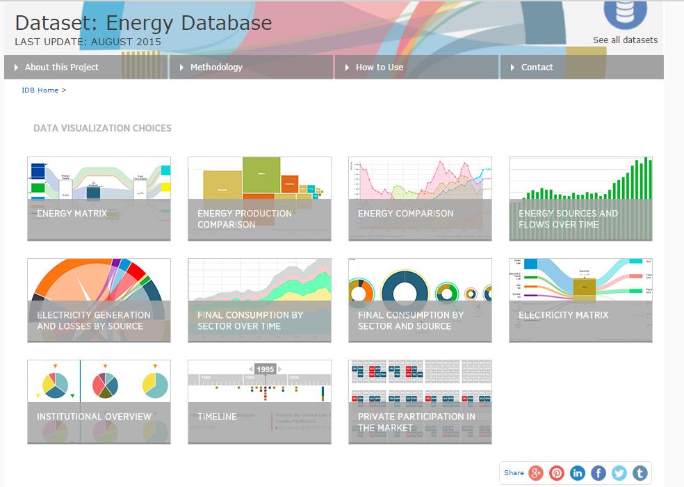
The Energy Database is a visualization tool that displays quantitative and qualitative data in 11 sleek and user friendly graphs. Below are 5 brilliant suggestions about how to use the database:

1. A bird’s eye view of a country’s energy landscape
The Energy Matrix allows users to see how a country produces, consumes, and transforms energy. Below is a snapshot of Latin America and the Caribbean. By clicking on the various primary sources on the left, you can see how much of a certain source is produced, exported, and imported. In the case of Latin America and the Caribbean, crude oil is the largest primary energy supply in the region. Click on crude oil and you will see that for 2013, the region imported 8 KBOE/day and exported 1,251 kBOE/day. What does this mean? It means that with two simple clicks you already know that Latin America and the Caribbean is a net exporter of crude oil! A few more clicks and a concise overview of the region’s energy landscape quickly unfolds. You can further click to see which sources go into electricity generation, the production of oil products, and how various sectors consume energy.
2. Qualitative information never looked so good.
One of the unique features of the Energy Database is the presentation of qualitative data in graphs. Do you want to understand the institutional make up of a country’s energy sector? The Energy Database has you covered. Below is an institutional overview of the hydrocarbon sector for El Salvador. By clicking on one of the colored pie charts, such as imports for crude oil, you are able to see the private players (Puma with 65% shares and Uno/Grupo Terra with 35% shares) and government agencies (Consejo Nacional de Energia) involved in this activity. Once you get a feel for the colors – light blue will always represent Puma, an orange triangle will always represent the Consejo Nacional de Energia – only a cursory glance is required to know that Puma is also involved in other activities, such as the transportation of oil derivatives. You can change between the hydrocarbon and power sectors, and choose to see the institutional overview of other countries.
3. Compare and Contrast
The Energy Database also has a couple of energy comparison graphs that are useful for deeper analysis. The Energy Comparison graph below compares the imports of natural gas for five of the largest economies in Latin America, in KBOE/day. Over time, natural gas imports have drastically increased in Mexico, Brazil and Argentina but have not in Chile or Venezuela. Why is this the case? Good question. The Energy Database brings to light trends that can be further analyzed by interested researchers. Other comparisons can be made by clicking on a different energy source, changing countries, or changing the unit of measurement.
4. Dig Deep
Data in the Energy Database is presented in different units of measurement. Do you want to compare Guatemala with Mexico? The database lets you compare two disparately sized countries by allowing you to use normalized data such as production as a unit of GDP (boe/USD10,000 per year),per capita (boe/person per year), and even percentages in the case of the graph, “Energy Sources and Flows over Time.
5. Details, Details, Details!
The Energy Database gives you the ability to interact with data, letting you choose between countries, regions, units, and years. There is a “How to Use” function for each graph that explains everything you need to know to use the visualizations. Tabs at the top of the page provide more information about the project and the methodology used for each graph. The calculations are based on International Energy Agency data and other sources, while population and GDP data comes from the World Bank. Didn’t know you had an impressive interactive tool at your disposal? Now you do! To get started, visit the database here.


Leave a Reply